Leigh in all her bright print-mixing glory
When it comes to print mixing I have a hero: Leigh Wishner is the Museum Registrar-Coordinator at FIDM Museum & Galleries. She wears prints and she wears them well—with confidence. Leigh also knows a lot about prints and textile history in general. Her Instagram account @patternplayusa is a fascinating and colorful appreciation of 20th-century American textiles and the stories behind them. A book is to come. I can’t wait!
I asked Leigh for a few sentences that would summarize her print-mixing philosophy. And, typical for her, she accommodated generously.
Pattern mixing—a fun, but understandably daunting, subject. The rules are there are no rules, but that said...there are "guiding principles" I think help it all make sense. It all boils down to scale, color, and pattern family.
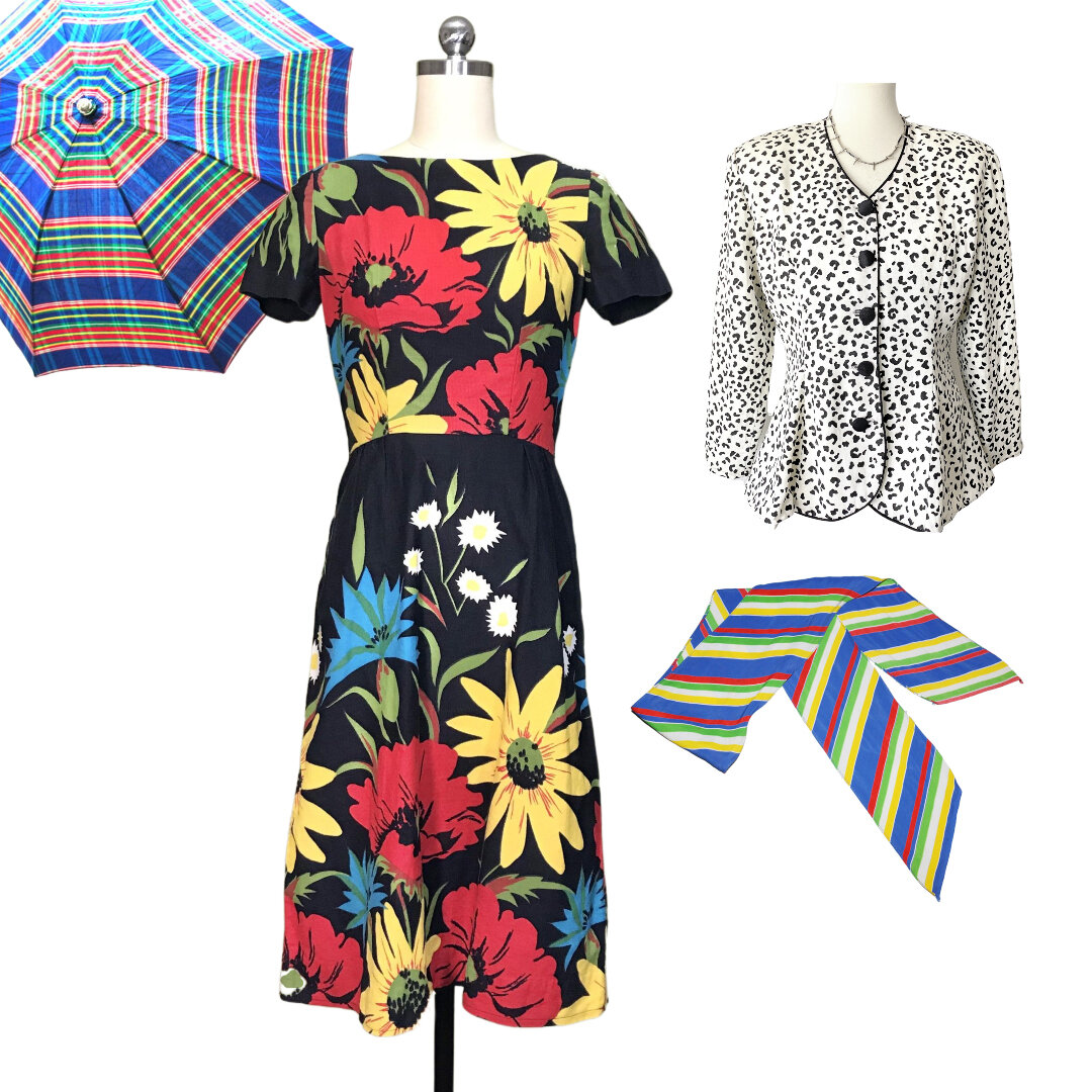
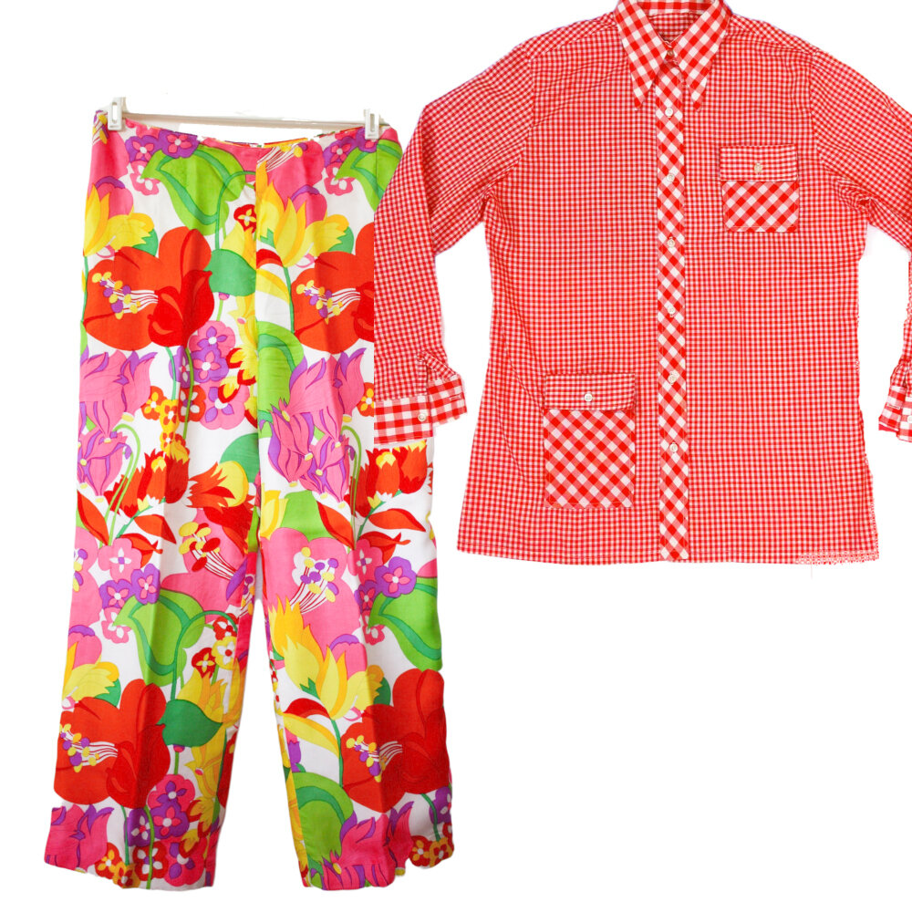
There are two ways to mix prints of different scales: either extreme difference in scales (like small dots with giant dots), or very similar scales (let's stick with dots--two similarly sized dot prints, but of different colors). That's one way I look at things when I'm getting dressed. Two big patterns can look great together! Two micro patterns also have that capability. But a huge pattern and a small pattern together really work best when at totally opposite ends of the scale spectrum.
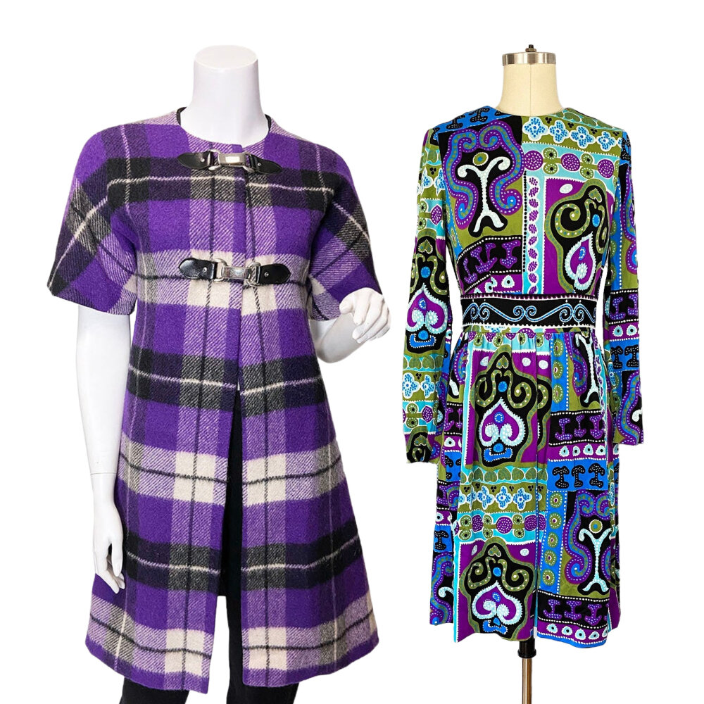
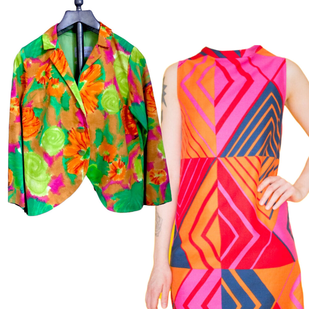
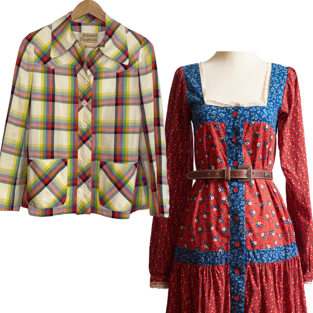
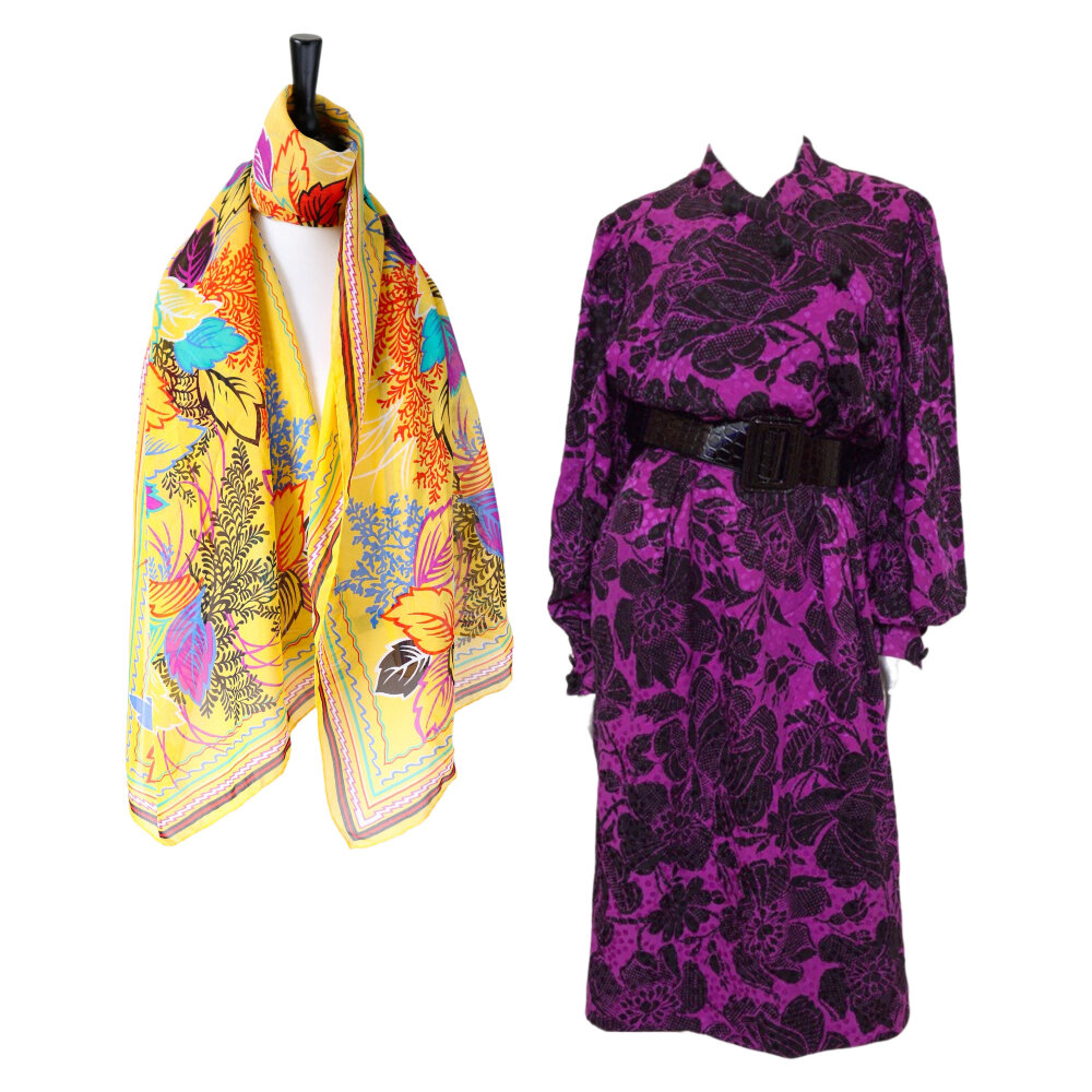
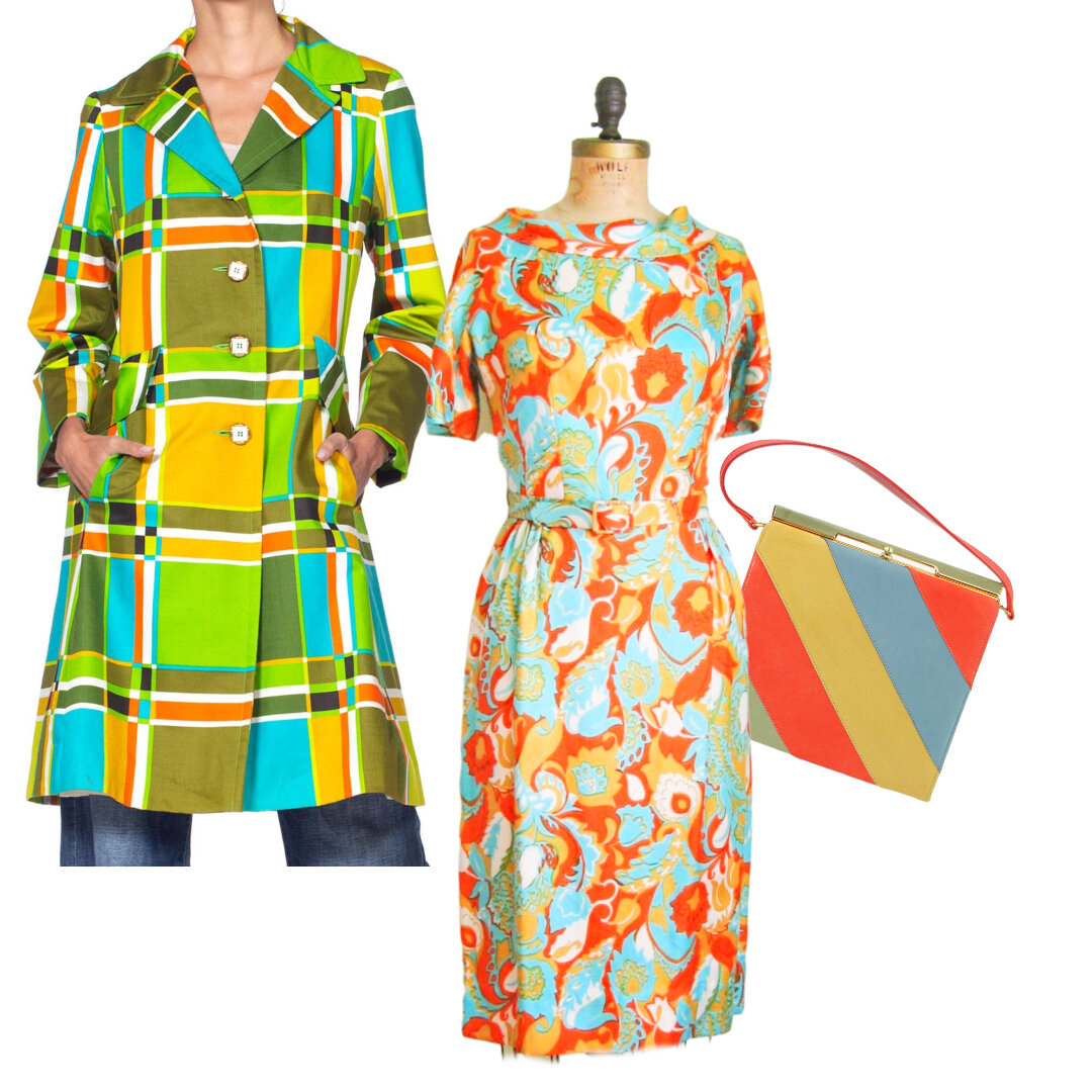
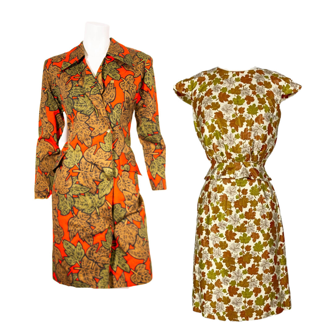
Color is the other pattern clashing/complementing factor. For me, one print usually picks up a color in the other print I'm wearing, like I have a William Morris print scarf that I like to pair with an Associated American Artists print that has overlap in terms of color and the motifs somehow "converse" with each other. Or, the colors don't "go together"—but there's something about the two dominant colors in the patterns that work in oppositions on the color wheel, like an orange-dominant floral pattern with a blue striped pattern. Or purple geometric with yellow gingham. You get the idea. Or totally monochromatic—a green leafy print and mod green chevron print sounds good to me!
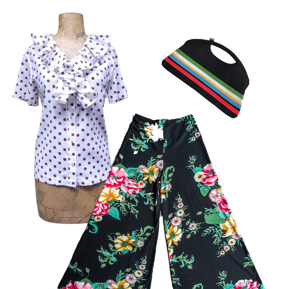
"Pattern family" can be a lot of fun to play with! Let's say you have several different checked things on at the same time. Or vertical and horizontal stripes. Or two different florals. This is where scale and color can really help you determine what looks best! But clashes in pattern families also yield brilliant results—think tartan and leopard print, or polka dots and paisleys. I also like to think about how shapes and styles complement each other—like hard geometry with soft florals (which describes a pair of black/white stripe palazzo pants I wear with a pastel lavender silk floral tea timer). Or something with lots of curves and arabesques with something equally florid.
I also always start by picking the one garment that I want to "anchor" everything, and then work from there. It's a trial and error process that often means things are strewn about until everything is "just so"! I can get obsessive and I always need to see everything together to make a holistic "diagnosis" for how well something works out vs. how my mind pictures it.
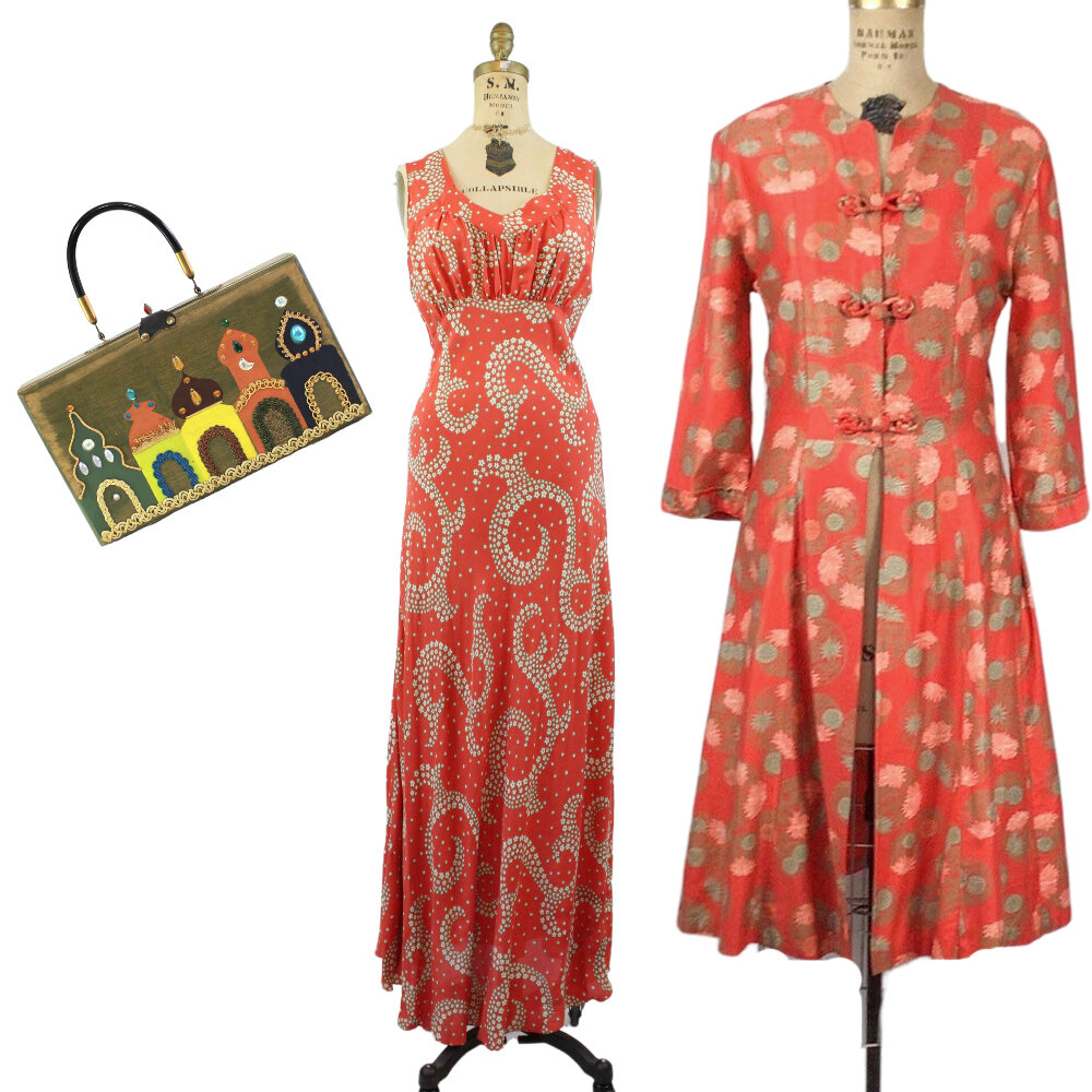
And...accents of solid colors for accessories are good, but you can also extend pattern to purses, shoes, scarves, etc! But always: do what you feel most comfortable with. If you're not comfortable in your choices, you'll never feel as good as you look.
Equipped with Leigh’s ideas, I put together items from Etsy searches; many of these you will find in my vintage print mixing favorites collection. One of her ideas I really took to heart is to start with something you want to anchor your other choices.
And that reminds me: Choose a print (and item) you love! Duh, right? Well, that really is the first step with all vintage wearing. Sometimes I forget to say the obvious.
